When you receive an invitation, the design is the very first impression of the event to come. While colors and layout play their part, typography is the real storyteller. The fonts you choose, how they’re paired, and even how they’re spaced can completely change the mood of your invitation making it elegant, modern, playful, or timeless. But with so many choices out there, it’s easy to go overboard. That’s why knowing the dos and don’ts of typography is key to crafting a design that’s both beautiful and functional.
The Role of Typography in Invitations
Typography is more than decoration it’s about communication. A well-chosen font can capture the essence of your event and guide the reader’s eye through important details like names, dates, and locations. The good news is you don’t have to be a professional designer to get it right. With tools that offer free printable invitation templates, you can experiment with different styles and combinations until you find a look that matches your event’s personality.
Typography Dos
1. Choose Readability First: No matter how stylish, a font should be clear enough to read at a glance. Guests shouldn’t have to squint to see the date or address.
2. Create a Hierarchy: Use one font for headings (like names or titles) and another for body text. This helps guide the eye and makes the invitation feel organized.
3. Match the Mood of the Event: A wedding might call for elegant scripts, while a kids’ birthday invitation could benefit from fun, playful lettering.
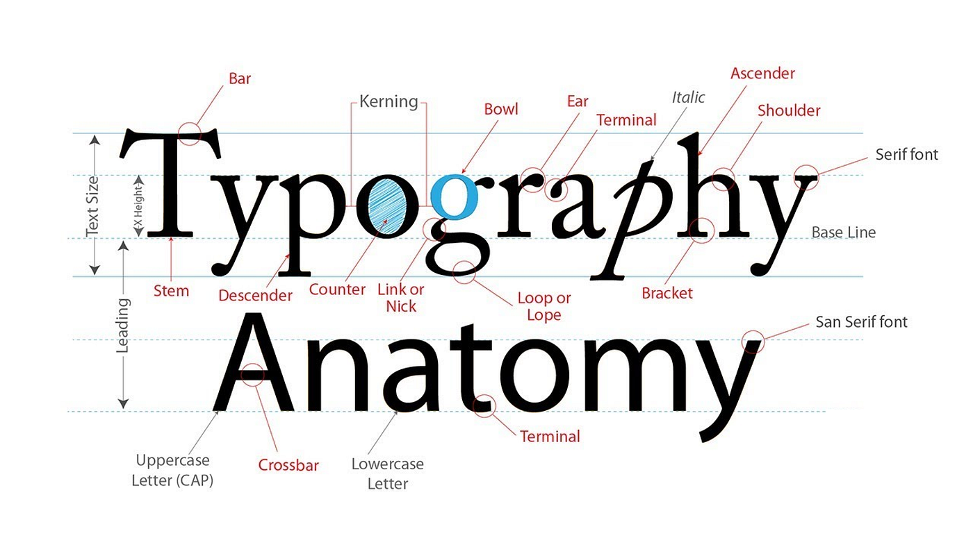
4. Use Contrast Wisely: Pairing a bold serif with a clean sans serif can create visual balance and highlight important information.
Typography Don’ts
1. Don’t Overload with Fonts: Stick to two, or at most three, fonts. Too many styles can make an invitation look chaotic and unprofessional.
2. Don’t Forget Spacing: Tight or uneven letter spacing makes text difficult to read. Proper spacing ensures clarity and elegance.
3. Don’t Sacrifice Function for Style: Decorative fonts should be used sparingly. They’re great for names or titles, but not for key event details.
4. Don’t Ignore Print vs. Digital: Fonts that look good on screen may not always print well. Always test a sample before finalizing.
Real-Life Inspiration
I once saw a wedding invitation where the couple’s names were written in a flowing calligraphy font, balanced by a classic serif for the details. It felt timeless yet modern. On the other hand, a birthday invite I received used three different decorative fonts all competing for attention. The result was confusing and hard to read, which took away from the excitement of the design.
Final Thoughts
Typography has the power to elevate or diminish the look of your invitations. By focusing on readability, balance, and consistency, you’ll create a design that not only looks polished but also communicates your event details clearly. Keep it simple, intentional, and true to the personality of your celebration, and your invitations will always make the right impression.
